A Small Design Experiment: Observing My Parrot Friend
- Ansh Trivedi
- Jan 15
- 3 min read

Updated: Mar 20
It Started With a Parrot
For a while, a parrot visited my window ledge almost every day. It didn’t scream, destroy things, or act like a typical bird. Instead, it just sat there and watched me work. Quietly. Judgmentally. Like a tiny green supervisor.
At some point, it started to feel oddly familiar. Almost intentional. Like some long-lost ancestor checking in to see if I was doing something useful with my life. Then one day… it stopped coming.
Days passed. Then weeks. The window ledge stayed empty. This led to a spiral of questions:
Is it still coming when I’m not around?
Has it changed its routine?
Or… worst case?
Instead of overthinking it forever, I did what any reasonable designer would do. I built a system.

The Question Became a Design Problem
The real problem wasn’t “where is the parrot?” The problem was: I had no way of knowing. I couldn’t sit at the window all day. Checking randomly was just guessing. What I needed wasn’t more effort — it was continuous observation.

So, I decided to design a small, always-on bird detection setup using simple hardware and code. Not to obsess over live feeds, but to quietly collect evidence over time.
Also, full honesty: I couldn’t get it to detect parrots specifically (yet). So, I made it detect any bird, and I’d review the captures now and then to see if my friend ever showed up.
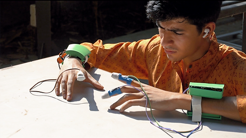
The Setup (Nothing Fancy)
The setup was intentionally simple:
A Raspberry Pi
A webcam placed on the window ledge
A lightweight bird detection model
A small web page to review what was captured

The camera watches the ledge continuously. When the system is confident that a bird is present, it saves a frame and logs the time. No notifications. No alarms. No constant monitoring. Just… watching.
Designing the Logic Was the Real Work
The hardest part wasn’t the hardware or the code. It was deciding what counts. Real life is messy:
Changing sunlight looks like motion
Leaves move
Shadows move
Pigeons behave like pigeons
So, the design work went into:
Filtering false positives
Setting confidence thresholds
Adding cooldowns so it doesn’t save 200 near-identical frames
Deciding what’s useful to look at later
This is where it stopped feeling like a tech project and started feeling like design.
The Interface (Built for Restraint)

I made a simple web interface to review the system:
Live view of the ledge
Bird count for the day
Recent bird captures
Rough time windows when birds usually appear
The goal wasn’t to create a flashy dashboard. It was to make something I could check occasionally, to see if my dear parrot friend had returned.
The Result (Plot Twist)
The system worked. Beautifully. It detected birds reliably. Logged them. Showed patterns. Predicted visit windows. And the result? Only pigeons! So many pigeons, uhhh!
The parrot never showed up. Which, oddly enough, was still an answer.
What This Taught Me as a Designer
You don’t need deep coding skills to build meaningful systems.
One simple idea + basic hardware can go a long way.
Most design decisions are about what to ignore.
Real environments are noisy — systems must be forgiving.
Sometimes, the most important outcome is confirming that something isn’t happening (sorry parrot friend).
Manifesting my dear *parrot friend's retur.
And somewhere out there, the parrot is either watching… or has moved on.

Expanding the Experiment
The Next Steps
After the initial success of my bird detection system, I thought about expanding the project. What if I could track the types of birds that visited? Or even create a database of their behaviours? This could lead to fascinating insights about urban wildlife.
Collaborating with Others
I also considered reaching out to fellow designers and tech enthusiasts. Sharing ideas and collaborating could enhance the project. Imagine a community of bird watchers, all contributing to a larger understanding of our feathered friends.
Future Innovations
The possibilities are endless! I could integrate machine learning to improve detection accuracy. Or even develop an app that alerts users when specific birds arrive. This could turn a simple observation project into a full-fledged research initiative.
Conclusion
In the end, this small design experiment taught me valuable lessons about observation, design, and the importance of asking questions. Whether it’s a parrot or a pigeon, every encounter offers an opportunity for learning and growth.
So, here’s to my parrot friend — wherever you are!


https://keonhacai5.com/ mình ghé thử cho biết vì thấy bạn bè nhắc, kiểu vào xem giao diện thôi. Ấn tượng đầu là trang chia khối nội dung khá gọn, nhìn lướt không bị ngợp chữ. Mình có dừng lại ở bài Girona vs Athletic Bilbao (03h00 ngày 05/11), tiêu đề để nổi nên kéo xuống phát là thấy ngay, đoạn nhận định cũng ngắn gọn nên đọc nhanh hiểu ý. Mấy phần tỉ lệ/kèo trình bày theo cột, spacing thoáng nên không phải nheo mắt như vài site khác. Thanh menu đặt chỗ dễ thấy, chuyển qua lại giữa bài đang xem cũng mượt. Nói chung mình thích cách họ căn lề và chia box thông tin, nhìn sạch và dễ…
ga vang tv dạo này mình thấy có người nhắc tới khi nói về các nền tảng giải trí trực tuyến nên cũng thử mở vào xem cách họ bố trí giao diện ra sao. Mình không đi sâu vào nội dung hay từng trò cụ thể, mà chủ yếu quan sát cách các chuyên mục được phân chia trên trang và cách thông tin hiển thị cho người dùng. Nhìn tổng thể thì các khu như thể thao, casino, game bài hay slot thường được sắp xếp theo từng nhóm khá rõ, hiển thị dạng khối và danh sách nên lướt qua cũng dễ theo dõi. Các bảng dữ liệu được trình bày dạng cột khá gọn, giúp quan…
https://dh88.bio/ hôm trước mình thấy link này xuất hiện mấy lần nên bấm vào coi thử cho biết thôi. Mình chỉ xem giao diện với cách họ trình bày nội dung chứ không tìm gì sâu. Cảm giác đầu tiên là trang nhìn khá gọn, các đoạn được chia thành khối rõ ràng nên lướt nhanh vẫn nắm được ý. Có phần giới thiệu thông tin nhà cái và họ để luôn mấy dòng về giấy phép/bảo mật ngay trong bài, kiểu không phải kéo tìm quá lâu. Mình cũng thích cách họ dùng tiêu đề to và khoảng trắng vừa đủ nên đọc không bị ngợp chữ. Nói chung nhìn qua thấy họ sắp xếp bài theo từng mục…
tỷ lệ kèo nhà cái dạo này thấy nhiều người nói quá nên mình ghé thử một trang tổng hợp cho biết, kiểu xem họ trình bày ra sao thôi. Vừa vào là đập vào mắt cái tiêu đề “Chào Mừng Đến WEbsite Của Chúng Tôi” khá to, đọc vài dòng là hiểu họ thiên về chia sẻ thông tin và cập nhật cho người mới. Mình thích nhất là cách họ chia nội dung thành từng khối rõ ràng nên lướt xuống không bị mỏi mắt. Có mấy ô dạng “Review Visit” xếp liền nhau nhìn gọn, ai muốn bấm xem nhanh thì tiện, còn mình thì chỉ liếc qua để nắm bố cục. Nói chung giao diện không…
tylekeo.design bữa mình thấy mấy đứa bạn share nên tiện tay ghé xem thử cho biết. Mình cũng không phải kiểu ngồi nghiên cứu sâu, chủ yếu lướt xem giao diện với cách họ trình bày có dễ hiểu không. Thấy ổn ở chỗ họ đặt mấy phần kiểu “kèo bóng đá là gì” với “tỷ lệ kèo” khá dễ nhìn, tiêu đề to rõ nên người mới vào không bị rối. Nội dung viết theo đoạn ngắn, đọc lướt vẫn nắm được ý cơ bản như tỷ lệ kèo là con số thể hiện khả năng xảy ra của một kết quả trong trận. Mình thích nhất là trang chia khối gọn, nhìn phát biết đang ở phần nào,…