TC-01 : A Bedside Thought Catcher Capturing Ideas Without Opening Your Phone
- Ansh Trivedi
- Jan 25
- 7 min read

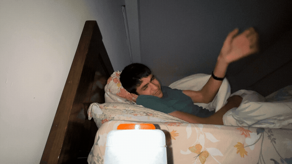
My best ideas have almost always chosen to come to me when I am about to sleep!
I don't know if a lot of you face this issue, but most ideas come to you when you are about to sleep. I don't know if it's something to do with your body going into the alpha state or if it's just the most optimal conditions for ideas, but it surely is an issue.
Because when I get up to open my phone and jot down the idea, I end up doom scrolling and checking for all the other most random and unnecessary updates my phone would have sent me.
If I ignore the thought and go to sleep, it’s usually gone by morning. Over time, this became a frustrating nightly pattern: ideas vs sleep, and I was always losing one of them.
Hence, I built the 'Thought Catcher' - a small physical device that lets me capture thoughts without opening a screen.

Phones as the Biggest Enemies
Phones have been proven to be the worst things ever. Well, actually not, but they have their own set of disadvantages. Honestly, using the phone at night is just bad.

At night, the goal is mental closure. You don’t want to engage with information; you want to offload it and rest. Phones do the opposite:
Bright screens
Infinite choices
Notifications
Social gravity
Even when kept far from the bed (which I actually try to do), reaching for a phone breaks the fragile “almost asleep” mental state. I didn’t need a better notes app. I needed a different way of taking notes, especially the ones at night.
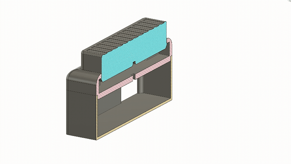
The Thought Catcher (TC-01)
The TC-01 is a small (the prototype is huge) screenless and harmless device that rests on my bedside table. It does one thing:
It catches thoughts when my brain is loud and lets me go back to sleep.

How do I use it? Super simple:
Press the button once.
Speak whatever is on your mind (idea, task, reminder).
Press the button again.
Hear a short beep = the thought is saved.
No screen. No notifications. No confirmation prompts. Just a button, a microphone, and sound-based feedback.
What Happens After You Speak? Magic!
Inside my Notion database, each entry gets:
Categorised as Idea, Task, or Note
A summary-style title inferred from the full transcript
A few relevant keywords
Urgency detection (for tasks)
A timestamp of when it was captured


The next morning, everything I would have forgotten is now noted, summarised, and organised. No half-written sleepy notes.
I don’t have to think about structure when the idea arrives. Just speak and zzzzzzzzzz.....
Alternate Use Cases
The Thought Catcher can be placed anywhere. You can have multiple catchers in places like your workplace, living room, and, god forbid, even in the bathroom!
Offload tasks and thoughts right after waking up before checking messages or emails.
Capture ideas or reminders while brushing teeth, without touching a wet or distracting phone.
A shared Thought Catcher in the living room that logs ideas or tasks with timestamps and voices.
But its primary design intent remains clear: Late-night, low-energy, low-friction capture.
What Happens Inside the Thought Catcher?
For those interested in the technical side, here’s a brief overview:
Hardware
Raspberry Pi 5 (the brain)
Physical button
Microphone (audio capture)
Buzzer (non-visual feedback)

Software
Whisper.cpp for offline speech-to-text
Python for:
- Intent inference
- Categorisation (idea / task / note)
- Title generation
- Keyword and urgency detection
Notion API for syncing
Continuous loop architecture; the code keeps running and catching thoughts!
Bonus: I get an optional daily and weekly progress email that mentions the ideas and tasks I uploaded that day/week!

The Making Process (From Idea to TC-01)
Problem Identification - Losing ideas at night or losing sleep to my phone became the core problem to design around.
Defined the interaction - first decided the process: press → speak → press → beep.
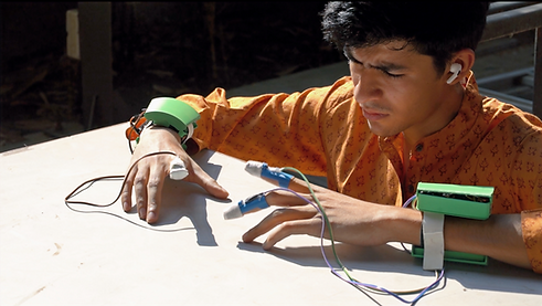
Quick hardware prototyping - Used a Raspberry Pi 5, a button, mic, and a buzzer to test the experience without worrying about bulk.
Built the software in layers - Started with basic recording → added offline transcription → then intent inference → finally Notion integration and email.
Iterated on software - Most iteration went into how the system interprets messy human speech into usable tasks and ideas.
3D modelling for enclosure experiments - Rough enclosures were modelled to explore bedside presence, button placement, and hand feel. A lot of remodelling and making was done to finally create a working button and housing.

Testing in real conditions - Used TC-01 at night, in the dark—where small friction points immediately became obvious.
User testing - asked people to try it out without giving them much context. Made necessary changes based on feedback.
Chose functional clarity over polish, knowing this is a first iteration (TC-01), not a final product!
Important Design Decisions
The simplicity of this device lies in a bunch of very intentional choices:
Designed for a mental state - This device is to be used at night, pre-sleep when you are half awake but the mind is in full swing. Everything about the device is tuned for minimal stimulation and minimal cognitive load.
Clarity - The confirmation beep creates a strong sense of reliability and lets the user know that what they intended to do has been done without overstimulating.
Button and not only voice operated - You can always use an Alexa or Google Home device. But with concerns of privacy, it’s honestly scary knowing that someone is listening to everything going on. It’s also impossible to create a voice-operated device that does not hear everything happening (that's the whole point). Hence, a button ensures privacy and a sense of security.
One button - No unnecessary learning curve and super simple user interaction. The device is made for when you're almost asleep, and the last thing someone in this state would want to do is search for the right button.
Only speak - No additional user input ensures ease of use and keeps the user experience minimal. The fewer decisions you have to make at night, the easier it is to stay calm and return to sleep.
Quiet & smart - The device quietly categorises entries (Idea/Task/Note), infers urgency, creates a summary title, adds keywords, and timestamps uploads — but none of that interrupts the user right before they are going to sleep.
Interaction as the Focus
As a product design student, I have learnt a lot about how users function, and for us, the user is GOD. Hence, I naturally obsess over the interaction.
It’s about intentional interaction — removing screens where they don’t need to exist and designing technology that respects human attention, energy, and context.
I'm sure you could be like, just use your phone. Well, the phone can do anything and everything. The TC-01 can't do everything. But it exists because of the side effects phones create.

Key Takeaways
The best design interventions don’t add features; they curate and add what is essential and remove anything that's unnecessary.
I learnt a lot from this simple yet fun project, and I think you can also learn from the following:
Remove decisions the user must take. The fewer choices, the higher the follow-through.
Trust beats accuracy when the goal is relief. Don't confuse the user. Provide all necessary feedback and signifiers (don't go overboard though).
Keep context in mind and design for context. In this project, the bedside table was pre-decided, and that helped in framing the interaction.
Use computational power in the background. You can turn the simplest inputs into mind-blowing outputs using offline as well as online computation.
End interactions deliberately. A clear stop prevents spirals, loops, and accidents.
Objects can hold intention better than apps. Physical presence anchors behaviour in ways software alone rarely does.
Design for misuse, not just ideal use. Your product should work in the worst of cases.
What Next?
The TC-01 is the first child. It's surely still a part of an experiment, and there are tons of improvements and changes that have to be made. Now that the core experience feels right, there are a few clear directions I want to push next:
Size and Form
The current prototype uses a Raspberry Pi 5, which makes the device bulkier than it needs to be. It was used for quick and easy prototyping but can be reduced to something much smaller and possibly a lighter and simpler micro-controller. The form can also be made to feel in place when kept on a bedside table. Things like:
Material - wood would create a warm and natural feel.
Form - softer edges and a smaller profile.
Stability - it can be given rubber grippers and slightly flatter for a more stable look and feel.

Computational Power
The interpretations and inferencing can be made much smarter using better code, either offline or also using other LLMs like OpenAI and Google Gemini for more detailed, human-like inferencing. Interpretation can be more nuanced - especially for messy, emotional, or multi-part thoughts.
Feedback and Interaction
There’s also room to experiment with how the device communicates the interaction and inculcates trust - whether through different sound patterns, haptics, or even subtle physical cues, without increasing stimulation or distraction.
Other Contexts
The same concept and principles can be translated to different contexts and use cases as briefly discussed earlier.
The Thought Catcher began as a simple fix for my dumb problem, but I see it as something that many people could put to use.
What surprised me is how little “tech” it actually needed — just a calm, reliable ritual: press, speak, beep, done. No screen, no temptation, no spiral.
Hope to take this forward and would love feedback, ideas, or suggestions (especially on making the language understanding smarter).
Happy to share code or the circuit if people are interested!


Really liked how this post kept things simple and didn’t drag on with a bunch of extra jargon. It felt like someone explaining it the way they’d talk in a chat, so I could skim and still get the point. Halfway through I clicked around https://newimage.io/ out of curiosity, and it gave me the same kind of clean, no-drama feel—nothing shouting at you, just straightforward stuff. I’m not usually patient with messy pages, but this one (and that site) didn’t make me hunt for the important bits. The spacing and short chunks help a lot when you’re scrolling on a phone. Also, the headings are easy to spot and the layout stays tidy instead of turning into a wall of…
KUWIN mình mới ghé thử vì thấy bạn bè nhắc hoài, vào kiểu lướt nhanh cho biết thôi. Giao diện nhìn khá dễ thở, không bị nhồi chữ nên tìm mục cần đọc cũng nhanh. Mình có bấm qua phần hướng dẫn FAQ đọc vài đoạn, thấy họ có nói kết quả game chạy theo RNG chuẩn quốc tế và hệ thống đối soát tự động, đọc qua thì cũng đỡ lăn tăn hơn. Menu để ngay trên đầu nên chuyển qua lại giữa trang chủ với tin tức khá mượt, không phải bấm nhiều lớp. Nói chung cảm giác họ sắp xếp nội dung gọn gàng, đặc biệt mấy khối “TIN TỨC” với “Hướng Dẫn & Giải Đáp” tách…
keonhacai5 bữa trước mình lướt thấy trong group nhắc hoài nên tiện tay vào coi thử cho biết. Mình không phải dân bắt kèo gì đâu, chủ yếu xem cách họ để thông tin có dễ theo dõi không. Vào cái là thấy bảng kèo odds cập nhật liên tục, kiểu đang ngồi nhìn mà số nó nhích theo thời gian thực nên đỡ cảm giác “tin cũ”. Mình cũng để ý họ có đoạn giải thích thuật ngữ kèo nhà cái khá dễ hiểu, nhất là phần kèo châu Á handicap, đọc vài dòng là nắm được ý chấp là để cân bằng hai đội. Nói chung nhìn không rối mắt, số liệu canh hàng thẳng, bảng tỷ lệ…
bongdalu 808 hôm bữa mình lướt thấy bạn bè nhắc nên bấm vào xem thử cho biết thôi. Mình không kiểu ngồi phân tích kèo hay đọc hết tin đâu, chủ yếu xem họ làm giao diện ra sao. Vừa vào là thấy phần tỷ số trực tuyến với lịch thi đấu đặt khá nổi, nhìn một phát là nắm được vì họ chia khung rõ ràng, kéo xuống cũng không bị loạn mắt. Mình thích cái cảm giác chữ số và cột canh thẳng hàng, nhìn gọn nên không phải căng mắt dò từng dòng. Menu cũng để ngay trên dễ thấy, bấm qua lại không phải tìm lâu, đặc biệt mấy box kết quả lịch hiển thị dạng…
tỷ lệ kèo bóng đá mình cũng mới lướt thử vì thấy mọi người nói nhiều, kiểu vào xem giao diện có dễ nhìn không thôi chứ mình không phải dân soi kèo gì. Trang này cho cảm giác khá “thẳng”, mở ra là thấy bảng kèo nhà cái hiện rõ, dạng cột nên nhìn phát hiểu liền, không phải kéo qua kéo lại nhiều. Mình thích cái cách họ cập nhật khá nhanh, đang xem mà số liệu nhảy liên tục nên đỡ phải F5 hoài. Với lại phần nội dung họ gom theo các giải lớn nên tìm trận mình quan tâm cũng nhanh, không bị rối. Nói chung dùng vài phút đã quen tay vì menu đặt…